Technology changes every year. As a result, a good presenter needs to change as technology changes as well. In this episode, we cover seven of the best PowerPoint tips and tricks for 2020. If you want to avoid Death by PowerPoint, this episode can be a great help.
Just as an FYI, though, these seven tips are best-practices for in-person, live presentations. If you happen to be delivering a webinar or video, stay tuned for the next post. The design process for webinars is quite different than in-person speeches. In fact, some of the tips I give here will actually be exactly opposite of tips for webinars.
Below is a summary of the 7 Best PowerPoint Tips & Tricks for 2020. I will go into detail for each.
- Start by Designing Your Speech. Then, Design Your Visual Aids.
- Focus on Just a Few Bullet Points Covered Really Well.
- Make Your Slide a Visual Aid for The Audience, Not a Cheatnote for You.
- Avoid Accessive Photos, Animation, and Graphs on Your PowerPoint Slides.
- Be Careful Using Recorded Videos When Delivering a Live Presentation
- Every Once in a While, Create a Spontaneous Visual Aid.
- Just About Any Other Type of Visual Aid that You Add Can Make Your Slideshow Better.
7 of the Best PowerPoint Tips and Tricks for 2020
Start by Designing Your Speech. Then, Design Your Visual Aids.
I was working with a group of presenters last week. I mentioned offhandedly to design your speech first, then design your PowerPoint slideshow. A few minutes later, after we had covered a number of other tips, one of the ladies stopped me. She said, “I’m still thinking about that ‘design your speech first’ tip. That seems like such a simple solution, but I always start by designing my slideshow. And, incidentally, I always end up with a not-so-good speech.”
The truth is that most every presenter makes this fatal error. I call this the kung-fu movie approach to designing a speech. When I was a kid we sometimes watched dubbed kung-fu movies on TV on Saturday morning. The sounds and voices never quite matched what was happening on the screen. When you design your visual aid first, you create the same problem for yourself. Instead of designing an awesome speech, you design a pretty slideshow. However, now, you have to dub your speech into the pre-created PowerPoint show.
Focus on Just a Few Bullet Points Covered Really Well.
Here is something that you will likely never hear after a presentation. “That PowerPoint slideshow was just way too short and didn’t have near enough bullet points.” In fact, the absolute biggest complaint that audience members give after a speech is the opposite. “It was too long,” or “I’m not sure what I’m supposed to do as a result of all of that content.”
The more content that is crammed into a presentation, the less likely anyone will retain the information. A presentation can either be like Jack-in-the-Box or In-N-Out Burger. A presentation with dozens (or hundreds) of bullet points is like the menu at Jack-in-the-Box. It has hundreds of products, so wait times are long and food quality isn’t great. (Have you ever gotten stuck behind someone at Jack-in-the-Box who is trying to figure out the menu? It stinks.)

In-N-Out Burger, though just has burgers and fries. As a result, service is pretty fast and food quality is great. Presentations are the same way. If you cover a lot of different bullets, your audience will be confused and bored. A more focused presentation with just a few bullets is better received, though.
A good technique for determining what to cover in your bullet points is to ask yourself, “What are the absolute, most important things that my audience needs to know about this topic?” This technique will help you scrutinize your content so you are only including the most important pieces of content.
Make Your Slide a Visual Aid for The Audience, Not a Cheatnote for You.
Make your bullet points complete sentences instead of abbreviations. For some reason, people like to just put vague, one or two-word terms as bullet points. Speakers use this as a crutch to help them remember what they are going to say. Really, though, the technique doesn’t work. In fact, if you have ever lost your train of thought and forgot what you wanted to say, you were most likely doing this.

In addition, these sentences should be provable statements. Pretend like you are an attorney. You are making statements to your jury, your audience, that you have to prove. This makes your presentation much easier to deliver. All you have to do now is read your statements, and then prove that the statements are true.
For instance, a bullet point like “Quarterly Expenses” tells the audience nothing. “Expenses Decreased by 7% Last Quarter” is much better. The later can be proven with data or a story. In the same manner, a bullet such as “What Happened to Expenses Last Quarter?” again tells the audience nothing. The audience may remember the question, but not the answer.
Avoid Accessive Photos, Animation, and Graphs on Your PowerPoint Slides.
This is the tip that almost everyone fights. I’ve heard people say that you need lots of pictures because a “picture is worth a 1000 words.” In addition, I’ve also had people tell me, “Slides in our PowerPoint slideshows are ALL charts and graphs.” I hate to be the bearer of bad news, folks. Both of those concepts can be very bad for your audience.
We may end up doing a whole session on this topic because it is so big. For now, though, try a few of these tips and see if you get better results.
For instance, instead of putting lots of photos in your slideshow, try creating a board or poster with the picture. It will have more longevity and will look more professional. Instead of loading your slideshow with charts and graphs, create a handout for your audience. The handout will be much easier to read and understand.
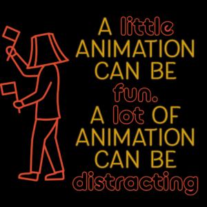
A little animation can be fun and cute. A lot of animation, though can be a distraction.
Be Careful Using Recorded Videos When Delivering a Live Presentation
One of the greatest assets of delivering a live presentation to an audience is the esteem that the audience develops for the speaker. Recorded vides of other speakers actually has the opposite effect.

I was invited to a negotiation seminar once. The speaker who invited me was a fantastic presenter. The audience loved him. However, the company offering the seminars forced their speakers to use 1980’s prerecorded VCR (yes VCR) sessions at times during the seminar. Granted these were recordings of the founder of the class, and the content was great. However, every time he showed another video, he was just telling us, “Here is the real expert on this topic.”
If you decide to use videos in your presentation, be careful. The best way that I have seen videos used in presentations is as background animation while the speaker is talking. The video will then add to the speaker’s authority.
I sometimes play funny videos related to my topic during breaks. These add a little entertainment when no one is speaking at the moment.
Every Once in a While, Create a Spontaneous Visual Aid.
One of the best PowerPoint tips and tricks is to stop using PowerPoint during your presentation. Every once in a while hit the “B” button on the slideshow to blackout the presentation. Then, create a spontaneous visual aid on a whiteboard or flipchart. Audiences like when speakers tailor the presentation to the group. Your delivery will seem even more customized to their needs.
Just About Any Other Type of Visual Aid that You Add Can Make Your Slideshow Better.
The final PowerPoint tip is to use other types of visual aids as well as your slideshow. I’ve already mentioned posters, boards, handouts, spontaneous drawings and the like. However, there are dozens of other types of visual aids as well. For instance, when you tell a good story about one of your bullet points, you are creating images in the minds of your audience. So, stories and anecdotes are fantastic visual aids.
A good analogy can also help your audience see your point in a different way. What I’m saying here is to don’t be so tied to your slideshow that you forget that you are really communicating with your audience. If you rely less on PowerPoint, you will be a much better presenter!


